-
Architects: dongqi Design
- Area: 504 m²
- Year: 2020
-
Photographs:Raitt Liu
-
Manufacturers: Gainker, MAXBRILLIANT

Text description provided by the architects. dongqi Design has managed to interpret the brand spirit of Estée Lauder Companies by using architectural language in the ELC pavilion II at the China International Import Expo (CIIE).


The pavilion was a cube from the outside, being divided into separate areas inside to display ELC’s corporate culture and the 19 brands. The overall layout, which was developed from a grid system, turned out to be a dynamic one with rounded corners after deliberate discussions. The size and position of each area met the needs of each brand. The exhibit route was carefully designed to connect each band area and to make sure a rich experience for the visitors.


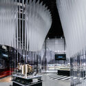
The whole partition system, which was the essential part of the spatial form, was cut into two parts vertically, with the translucent acrylic part on the top and the transparent part on the bottom. The partition system was composed of vertical acrylic fins which were arranged with a gradient change of angles generated by a certain algorithm. The sections of the translucent acrylic fins get larger from bottom to top. When people move through the pavilion, they would experience the change of the lights and shadows of the bottom part of the acrylic walls while the variety of shapes and sizes of the upper part at the same time. The atmosphere was changing all the time. One can feel open and shining as if he was in a crystal garden in one moment, and feel narrow and serene as if he was in a deep forest when turns a corner.


The architects were deeply collaborating with steel structure engineers during the whole design period. The idea was to make the structural system visually invisible to the full extent on the premise of structural security. The steel columns were designed long and flat to approach the shape and size of the acrylic fins. They were also arranged with certain angles on the plan in order to be integrated into the acrylic partition system. Meanwhile, the structural performance was enhanced. The steel beams and columns were coated with a mirror finish to conceal the volume and to be light and graceful like the acrylic walls.


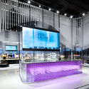
The design language of the acrylic wall system was also applied to each brand area, especially the display fixtures. After a close discussion with the team of ELC, materials were chosen respectively to build the display fixture according to the tonality of each brand. For instance, black mirror-finished stainless steel and mirror-finished stainless steel were used as a pair to echo the temperament of one of the brands. The lighting design was not only considered functionally to meet the needs of visual merchandising designers but narratively as well to highlight the atmosphere.


When observed from a distance, the pavilion was just like a pure crystal with thousands of facets, each of which reflected back its own tone and color, fusing the whole environment and family members together. The delicacy of transparent acrylic together with the softness of translucent acrylic demonstrated the definition of beauty given by ELC which is: to be tender and wise, delicate and graceful. The pureness of the acrylic cube tolerated and included everything. It also went well with the theme of the ELC CIIE II: Made of prestige.


